Graphic Design
Editorial Book Design “A Quiet Invasion: When Words Become Walls”
I created a speculative book examining how modern surveillance and propaganda shape public perception, using cases like Chinese censorship and Brexit-era messaging. All data visualizations, layouts, and visual systems were designed from scratch to build an urgent, real-world tone.
The book uses a red, black, and white palette to evoke danger and control, with newspaper-inspired typography highlighting how information is constructed and manipulated. Selected spreads were screen-printed to add texture and disruption.
I also produced original photography, including an image of a person wrapped in newspaper to symbolize how individuals are silenced or consumed by propaganda. This photograph became the central screen-printed visual for a posterzine that extends the narrative.
Together, the book, screen-printed elements, custom data visuals, and posterzine form a stark, immersive commentary on the future of information control.

Campaigns
"A Man Or A Shark"
For the Shark Project, I set out to challenge misconceptions about sharks by comparing human and shark impact. Research into behavior, ecology, and attack statistics revealed that humans are the real threat-leading to the campaign message: “Who is the real predator?”
I created a bold visual system using bright colors, modular shapes, and custom type, then applied it to Instagram animations and data visuals with attention-grabbing quotes. The posterzine brought all elements together into an energetic, readable layout, while a fabric banner and interactive kit added tactile, memorable experiences across both digital and physical formats.

"Future Sound Festival"
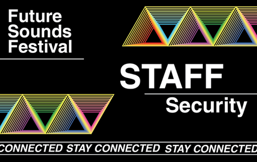
For the Future Sounds Festival, we created a modular visual identity where each color represented a different music genre. This allowed visitors to choose wristbands and lanyards in their genre’s color, helping them connect with others who shared similar tastes.
Using vibrant colors on a black background, we built an energetic, flexible system tested through a series of posters and layouts. We also designed physical materials-lanyards, cards, strings, and wristbands-with color and pattern variations for VIPs, staff, and general visitors, bringing the identity to life both digitally and in physical, wearable formats.

Country Council Collaboration Project “Less Traffic, More Time for...”
As Art Director of the project, I shaped the visual direction and ensured the campaign stayed cohesive from concept to final execution. Research into behavior-change campaigns showed that simple messaging, bold colors, familiar objects, and clear benefits were most effective-guiding our overall approach.
We built a clean, impactful visual system using bright, high-contrast colors and large typography. Each poster featured the headline “Less Traffic, More Time” with variations like Dinner or Drinks, paired with a single photographed object on a bold background. A looping white line linked all assets, creating a unified, adaptable identity.
I oversaw storyboards, maintained visual consistency, coordinated team communication, and refined copy and object choices. The final campaign is simple, memorable, and broadly appealing, highlighting the everyday advantages of choosing alternatives to car travel.
Data Visualisation

Based on my research into website cookies, I created data visualization that highlights the types of information websites collect most often. Since the topic can feel a bit “hidden” or even uncomfortable, I have used bright, bold colors to make the visual more engaging and almost ironic. The contrast between the playful palette and the seriousness of the data is a good way to capture attention while still showing something meaningful.
Typography
“Volya Typeface”
"Volya" is a display typeface inspired by the ongoing Ukraine-Russia war. It merges traditional Ukrainian embroidery patterns-each tied to specific regions-with the fractured forms of buildings destroyed during the conflict. By combining cultural heritage
with visual traces of devastation, the typeface reflects both the brutality faced by Ukrainians and the resilience of their identity.
Named after the Ukrainian word for “freedom,” Volya is designed for large-scale use, where its sharp, intricate patterns can be fully appreciated. Even its price (1991. 08), 24/08/1991, references the date of Ukraine’s independence from the Soviet Union,
grounding the typeface in its historical and emotional context.
"Typeface Experimentations"
I’ve been experimenting with shape, structure, and form to explore how typography can communicate mood, rhythm, and identity. These studies play with distortion, repetition, abstraction, and modular systems, allowing me to test how far a letterform can be pushed
while remaining functional. This ongoing experimentation helps me develop new visual ideas and refine my understanding of type as both a design tool and an expressive medium.
Posters

“Volya Posters”
For the accompanying poster for “Volya” typeface, I projected it onto a semi-nude British-Ukrainian model to explore themes of vulnerability, identity, and the far-reaching impact of the war. The model’s face is intentionally excluded, using the body as a universal canvas to emphasize how conflict dehumanizes, sexualizes, and objectifies people across borders.
The projection allows the typeface’s embroidered patterns and brutalist forms to wrap around the body, creating a striking contrast between cultural tradition and the physical
fragility of those affected. This poster acts as a visual extension of the typeface message, preserving identity while highlighting the violence and trauma imposed on it.
Editorial Book Poster Experimentation


